We are proud to announce an awesome addition to the AutoPro.io dealership management software.
We just added a whole new view to the analytics module.
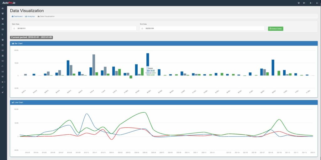
Our brand new Data Visualization view gives you a quick graph with a monthly overview of your dealership over a certain time span.
At a quick glance you can see your sales, purchases and profit, on a month by month basis over whatever time span you want.
This is a brand new feature and will be evolving over time.
Stay tuned for many more amazing additions to this new tool!
These graphs took approximately 2.3 seconds to generate.
No seriously, it’s that quick!
Instantly get an idea of the health of your dealership’s operations for any time frame you want.
You and your team deserve to have the power of AutoPro.
Keep scrolling down to check out the different types of charts that are currently available below
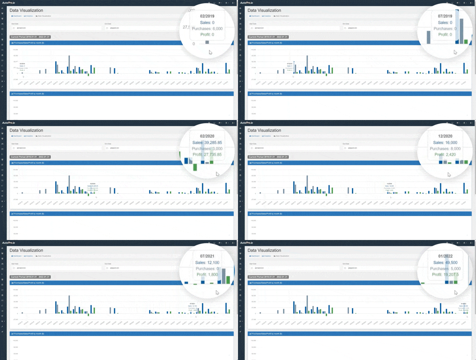
Bar Chart showing Purchases/Sales/Profit by month in dollars
The first chart you will see is an interactive bar chart showing total purchases, sales and profit, on a month by month basis for the selected period.
You can get an instant idea of the value of these metrics for each month, by hovering your cursor over that month’s data in the interactive chart.
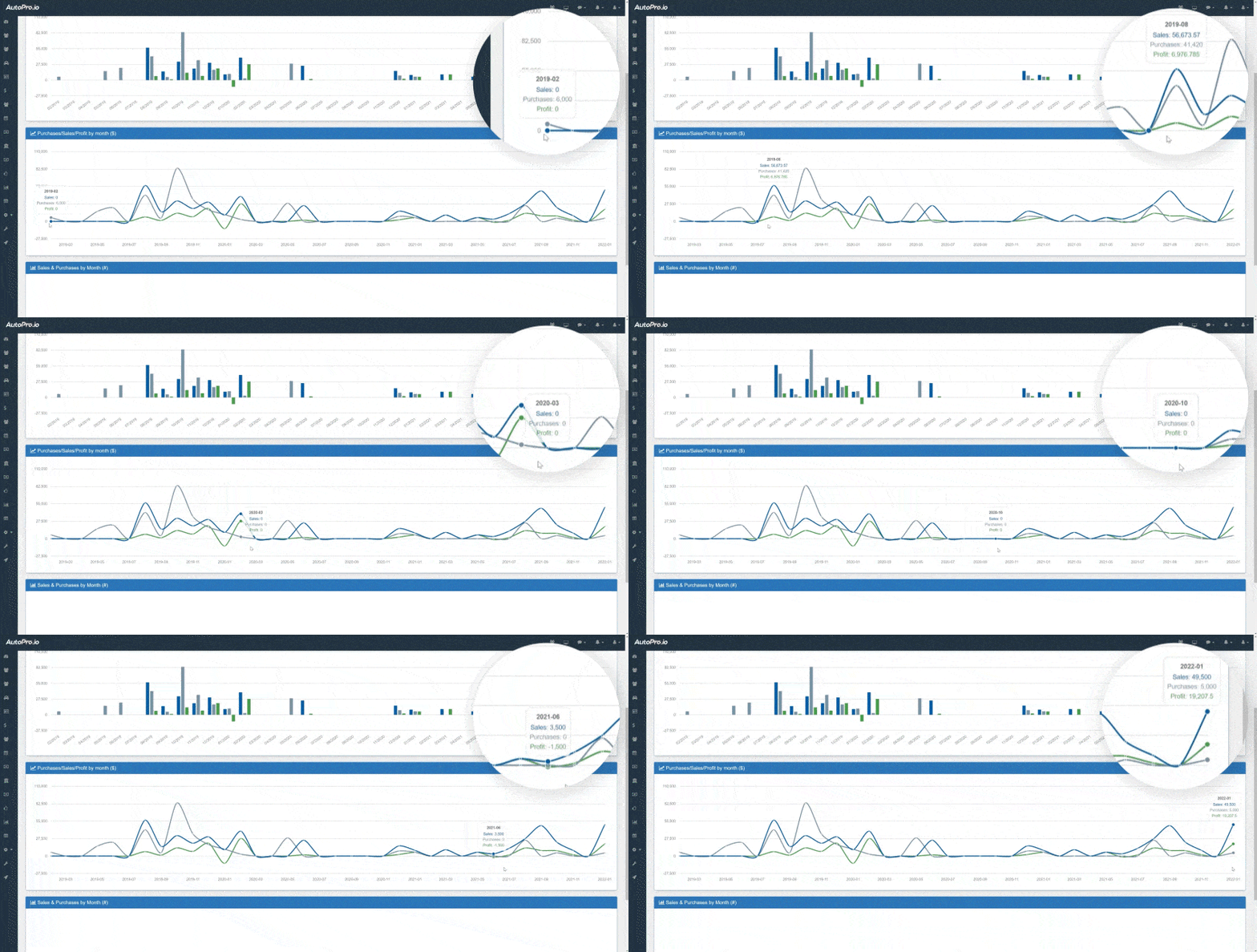
Line Chart showing Purchases/Sales/Profit by month in dollars
The second chart you will see is an interactive line chart showing total purchases, sales and profit, on a month by month basis for the selected period.
This chart shows the same data as the first chart, but in a different format.
The line chart allows you to get a visual representation of the progression of these 3 metrics over time.
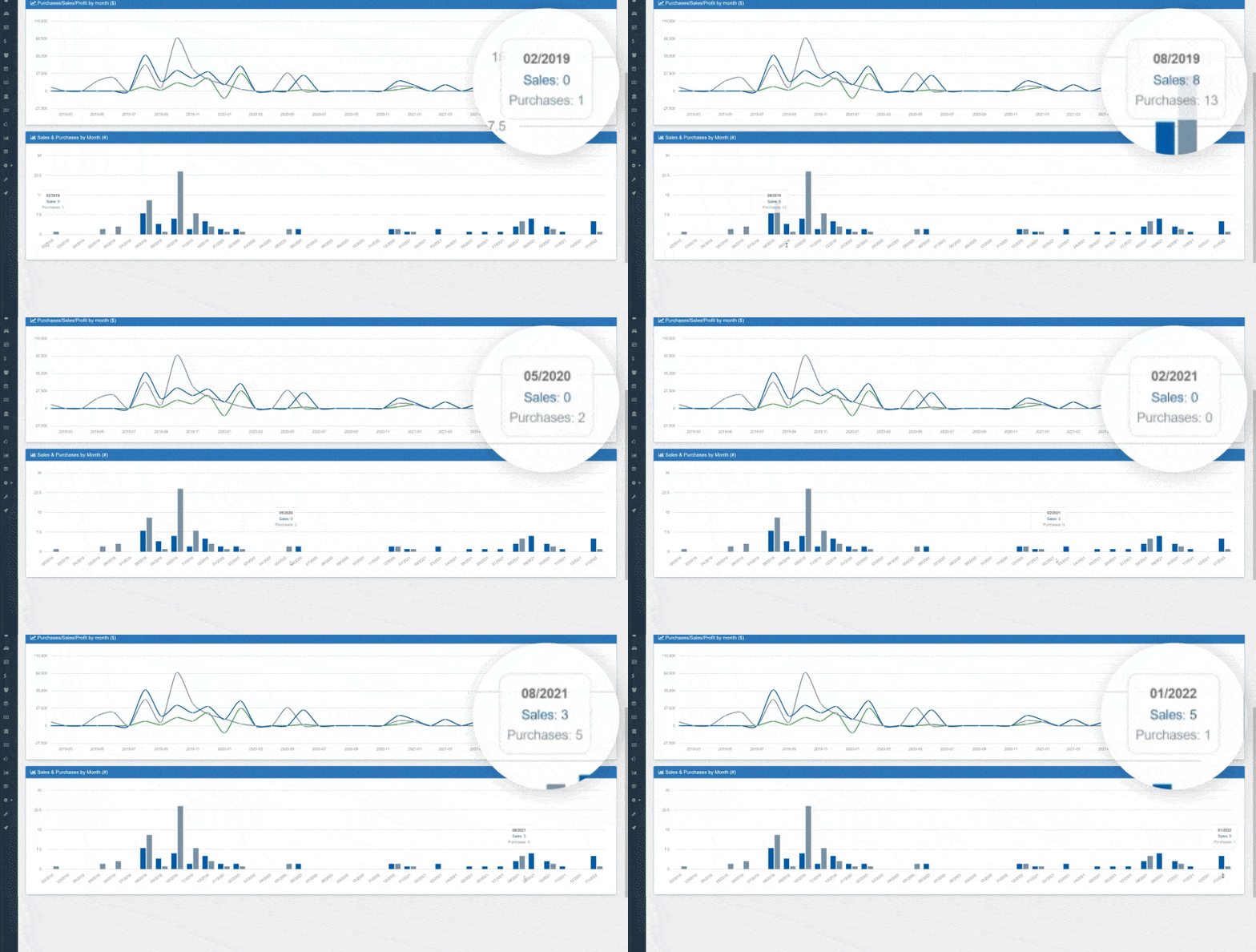
Bar Chart showing the number of Purchases & Sales by month
The third chart you will see is an interactive bar chart showing the number of purchases and sales at your dealership, on a month by month basis for the selected period.
This chart allows you to quickly see the number of purchases and sales, while also seeing the progression over time.

